10 Steps to Create a Modern Website for Your Business
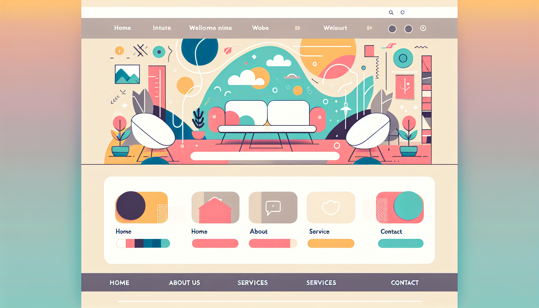
To succeed in the fast-paced digital landscape, a modern website is no longer optional, but a necessity. As a modern business owner, you understand that a website is your digital storefront, often making the first impression on potential clients and customers. Modern Connective is here to help you break down the art and science of developing a captivating online presence.
Creating a modern website encompasses more than just a visually stunning design; it’s a holistic balance of aesthetics, user experience (UX), accessibility, and consistent branding. But how do you go about building one? What are the critical elements that define modern website design, and how can you incorporate them into your business’s digital identity?
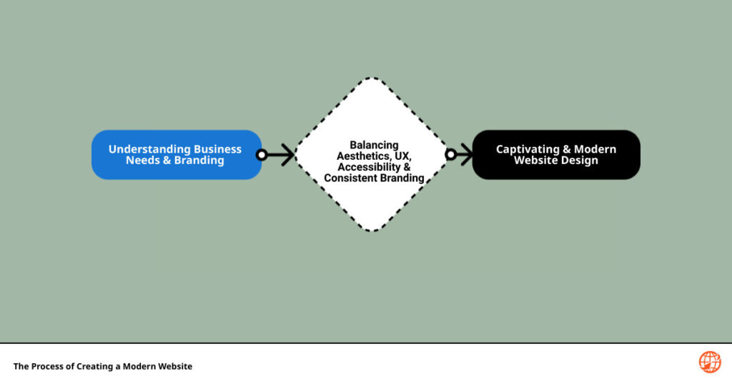
Our forthcoming guide, ‘10 Steps to Create a Modern Website for Your Business‘ is rooted in industry best practices, top design trends, and our own expertise, developed from years of experience in helping businesses like yours. We’ll take you through understanding the importance of modern website design, the top trends defining 2023, practical tips for designing your website, and then some.
However, before we delve into these details, here’s a quick teaser of the ten steps that we’ll explore in detail:
- Understand the role of website design in securing business credibility.
- Incorporate user experience and accessibility in your design.
- Identify and leverage the top web design trends of 2023.
- Apply practical tips for creating a modern website design.
- Draw inspiration from the best modern web designs.
- Leverage the skills of experienced UX developers and website designers.
- Incorporate emerging design trends into your website.
- Tackle challenges in creating modern websites head-on.
- Consistently update and improve your website as needed.
- Evaluate your website’s performance and make necessary adjustments.
Welcome to your comprehensive guide that aims to equip you with the insights needed to create a modern website, propelling your business’s online impression into the future. Buckle up for a deep dive into the world of modern website design!
Understanding the Importance of Modern Website Design
In the digital age, your website is often the first point of interaction between your business and potential customers. It’s your virtual storefront, open 24/7, showcasing your products, services, and brand identity to the world. Therefore, the design, functionality, and user experience of your website play a crucial role in converting visitors into customers.
The Role of Website Design in Business Credibility

Research indicates that 75% of user judgment about a website’s credibility is based on its design. In just 3.42 seconds, users form an opinion about your business based on the aesthetics and functionality of your website.
At Modern Connective, we understand that a professional, visually appealing, and user-friendly website design is essential in building trust and credibility. Whether it’s a clean, modern design for a tech company, a playful and creative design for an entertainment business, or a classic, sober design for more serious industries, we are experts in tailoring website designs to suit various business needs.
User Experience and Accessibility in Website Design
An essential aspect of modern website design is ensuring a seamless user experience (UX) across all devices. A large number of people access the web using their mobile devices. As such, a mobile-responsive design is not just important, but essential. Our team at Modern Connective prioritizes mobile responsiveness in all our web design projects.
Creating an interactive, engaging website is another vital part of enhancing the user experience. We do this by incorporating elements like animations, hover effects, and dynamic content, always ensuring these enhancements don’t distract from the main content.
Lastly, accessibility is crucial to ensure your website can be used by everyone, regardless of any disabilities they may have. By adhering to web accessibility standards, we ensure that your website can be navigated and understood by all users, including those with visual, auditory, cognitive, or motor impairments.
In the next section, we will delve into the top web design trends for 2023, providing you with insights and inspiration for your modern website design. Stay tuned!
Top Web Design Trends for 2023
Navigating the digital landscape can feel like a journey through an ever-evolving universe. But fear not! We, at Modern Connective, are here to guide you through the latest trends shaping the world of web design in 2023.
The Use of White Space in Modern Design
First up is the strategic use of white space. More than just an absence of content, white space is a powerful design element that promotes simplicity and focus. It’s like the pauses in a musical composition, giving your content room to breathe and increasing its impact. Think of it as the canvas upon which your content is placed, highlighting the importance of the minimalist content inside.
In fact, our team at Modern Connective has been experimenting with this trend, using white space to create visually arresting and user-friendly designs. The philosophy behind this approach is simple: less is more. Rather than overwhelming visitors with information, white space allows them to focus on what’s important, enhancing their overall user experience.
Full-Page Headers and Their Impact
Next on our list are full-page headers. Research shows that users tend to concentrate their attention on the top-left of a web page. Capitalizing on this insight, full-page headers have regained popularity. They often feature key text or call-to-action (CTA) buttons on the left, complemented by visually pleasant images on the right. This balanced design not only grabs attention but also directs users towards desired actions.
The Rise of Playful Cursors and Dynamic Scrolling
One of the more playful trends emerging in 2023 is the use of playful cursors. These dynamic elements can change form, color, or trigger animations when hovering over certain objects, creating a more engaging and interactive user experience.
Another trend set to make your website feel more alive is dynamic scrolling. By setting different scrolling speeds for your website’s foreground and background, you can create a parallax-like 3D effect that is sure to impress your visitors.
Custom Illustrations and Color Trends
Custom illustrations are another effective way to convey your brand personality and set yourself apart from the competition. They evoke emotions, create impressions, and build a personal connection between your brand and your web visitors.
Just as important as the visual elements is the use of color. In 2023, color is expected to take center stage, helping users better understand the information they’re viewing through contrast and emphasis.
The Popularity of Dark Mode, Collage, and Geometric Design
Finally, we cannot forget about the rising popularity of dark mode, collage, and geometric design. Dark mode inverts the traditional color scheme, providing a visually distinct and eye-friendly alternative for users. Collages offer a unique way to display multiple images or ideas, and geometric designs contribute to the overall aesthetic appeal.
Incorporating these trends into your website design can significantly enhance its visual appeal and user experience. However, it’s important to remember that trends are just tools; the key is to use them in a way that aligns with your brand identity and serves your audience’s needs. Stay tuned for practical tips on creating a modern website design in our next section!
Practical Tips for Creating a Modern Website Design
After understanding the latest trends, it’s time to dive into the practical aspects of creating a modern website. At Modern Connective, we combine the latest trends with proven design principles to create websites that are both stylish and functional. Here are some of our tried-and-tested strategies:
The Minimalistic Approach in Web Design
Modern design trends lean towards simplicity and clarity, and minimalism embodies these principles perfectly. A clean, uncluttered design helps visitors focus on what’s important: your content. This doesn’t mean your website should be barren or boring. Instead, it’s about strategically using white space and limiting the number of elements on each page to create a sense of balance and focus.
Minimalistic websites have several advantages. They tend to load faster than complex websites filled with large images or animations. They also appear more professional and credible, providing a better user experience. Remember, being minimalistic doesn’t mean being empty. It’s about being concise and clear, making every element count.
Using Video for Background Headers
Videos are a powerful tool for engaging visitors and conveying your brand’s story quickly. One popular trend is to use a video as the background for your website’s header. This creates an immediate visual impact and can help set the mood for your site.
However, it’s crucial to ensure that your video enhances the user’s experience rather than distracting from it. Keep it relevant to your content, and make sure it doesn’t slow down your site’s loading time. At Modern Connective, we’re experts in incorporating video backgrounds that boost engagement without compromising performance.
The Importance of Typography in Web Design
Typography can make or break your website’s design. It influences readability, user experience, and even the perceived trustworthiness of your site. Here are a few tips for effective typography:
- Choose a font that reflects your website’s purpose. A professional site might use a clean, modern font, while a creative site could use something more ornate or unique.
- Make sure your text is readable. This means choosing a font size that’s easy on the eyes and using line spacing effectively.
- Keep your color palette simple. Too many colors can be distracting and make your site look unprofessional. Stick to a few key colors that align with your brand.
The Use of Ghost Buttons and Card-Based Web Design
Ghost buttons, transparent buttons with a thin border, are a popular trend in modern web design. They can add a sleek, sophisticated touch to your site. However, they must be used correctly to avoid confusing users. They should be placed where users expect them to be, and their purpose should be clear.
On the other hand, card-based design involves organizing information into small, rectangular sections or ‘cards.’ This approach is highly versatile and user-friendly, making it a great choice for responsive design. It allows users to quickly scan and digest information, improving the overall user experience.
By combining these practical tips with the latest design trends, you can create a modern, user-friendly website that stands out from the competition and effectively serves your audience. At Modern Connective, we’re here to help you every step of the way. Whether you need remote support, marketing plans, or landing page design, we have the expertise and resources to bring your vision to life.
Examples of Best Modern Web Design
As the saying goes, “seeing is believing”. To help you visualize the potential of your own website, let’s take a look at some examples of the best modern web design in action.
Lettuce & Co: A Case Study

Lettuce & Co is a company that organizes events like weddings and birthdays. Their website is a testament to the power of minimalistic design. With a reduced amount of content on the homepage, the site is extremely easy to navigate. The use of high-quality pictures, well-chosen fonts, and a neatly arranged hamburger menu on the right side adds to the professional and stylish impression.
Brit + Co: A Case Study
Brit + Co is a media company for women. Their web design cleverly utilizes card design. The starting page showcases well-organized cards that make the site easy to navigate. Each card’s simple design, combined with the appropriate use of fonts and spacing, makes the content easy to read.
Deneen Pottery: A Case Study
Deneen Pottery is a company that creates stoneware. Their website features a video header that succinctly explains the company’s specialty. The ghost button on their homepage is large and easy to find, thanks to its strategic placement against the video. The contrast between the ghost button and a colorful CTA button draws attention, ensuring the ghost button doesn’t go unnoticed.
Marmoset: A Case Study
Marmoset is a company related to music search and licensing. Their website is one of the intriguing modern web design examples that effectively use ghost buttons. The buttons are placed against a suitable background, making navigation easy. Some pages also use card design, with each card containing a picture and a short title. The fonts used make the content easily readable.
Moscot: A Case Study
Moscot is a company where you can buy stylish glasses. Their website design is both stylish and functional. The fonts are catchy and recognizable, and the colors are well chosen. All links and content are well-located, making the website appear neat and organized.
These examples showcase the potential of modern web design. However, translating this potential into reality requires the right expertise and dedication. At Modern Connective, we bring both to the table. Whether you need help with website evaluation or Canva designs for products, we are here to assist. So why wait? Let’s create a modern website that truly represents your business.
The Role of UX Developers and Website Designers in Creating a Modern Website
With all the design elements, trends, and user experience considerations in mind, it’s clear that creating a modern website is no small feat. It requires the right blend of technical knowledge, creative expertise, and an understanding of your target audience. This is where UX developers and dedicated website designers come into play.
Why You Should Consider Hiring UX Developers
User experience (UX) developers are the architects of the digital world. They focus on understanding how users interact with your website, and use this knowledge to create an intuitive, engaging, and user-friendly design. They ensure that your website is not only visually appealing but also easy to navigate, responsive across multiple devices, and fast to load.
In other words, UX developers make your website functional and user-friendly. They ensure that your website’s design serves its purpose: to provide your visitors with the best possible experience, keep them engaged, and guide them towards the desired action – be it signing up for a newsletter, making a purchase, or filling out a contact form.
Hiring a UX developer is a smart investment that can dramatically enhance the effectiveness of your website. With their expertise, they can anticipate user needs and design a website that meets those needs while aligning with your business objectives.
The Benefits of Hiring Dedicated Website Designers
While UX developers focus on the functionality and user interaction of your website, dedicated website designers concentrate on the visual elements. They are responsible for the look and feel of your website, including layout, color schemes, typography, and imagery.
Dedicated website designers ensure that your website is not just functional, but also aesthetically pleasing and aligned with your brand identity. They can help you create a website that stands out from the competition and leaves a lasting impression on your visitors.
Moreover, hiring dedicated website designers also means you get a team that is fully committed to your project. They can provide you with personalized solutions, timely updates, and consistent support throughout the website creation process.
At Modern Connective, we have a team of skilled UX developers and dedicated website designers who can help you create a modern, user-friendly, and visually stunning website. We understand the importance of a well-designed website in today’s digital landscape and are committed to providing our clients with the best possible online presence. So why wait? Get in touch with us today and let’s start creating a modern website for your business.
Incorporating Emerging Trends in Your Website Design
Dopamine-Boosting Colors and Expressive Typography
Vibrant, dopamine-boosting color schemes and expressive typography are two design elements that can truly make your website pop. Take a page from Mango Marketing, a digital marketing agency that uses a vibrant orange throughout their website, reminiscent of their namesake fruit. This injects a cheerful and energetic vibe that instantly boosts the mood of visitors.
Similarly, expressive typography can be used to draw focus and convey important messages. Bold, oversized titles are becoming increasingly popular, taking over a significant portion of the screen and becoming impossible to ignore. As seen in Tiff Cruz’s website, her name is prominently displayed in a large, funky, cream-colored serif font, making it unforgettable and reinforcing her personal brand.

Dynamic Animation and Futuristic Aesthetics
Incorporating dynamic animation or web animation into your site can enhance user interaction and engagement. Movement captures attention, and using animations when visitors click, scroll, or hover can make your website more interactive and exciting.
Futuristic aesthetics, on the other hand, can give your site a cutting-edge feel. This could mean using abstract shapes, ethereal color schemes, or high-tech elements to create a forward-thinking design.
Organized Chaos and Retro Vibes
While order and balance are traditionally favored in website design, organized chaos can offer a refreshing change. This involves placing elements in unexpected areas or using asymmetrical layouts to create a sense of dynamism and originality.
Retro vibes, borrowing elements from past decades, can also add a touch of nostalgia and character to your website design. Consider experimenting with VHS video styles, medieval fonts, or pixelation to create a unique and engaging aesthetic.
Dark Mode, Modular Grids, and 3D Graphics
Dark mode, a setting found on smartphones and other user interfaces, is also making its way into modern website design. With a dark background paired with light-colored text and elements, dark mode gives websites a sleek, stylish appearance.
Modular grids, which involve dividing a page into uniform sections, can help organize content in an attractive and readable way. Meanwhile, the use of 3D graphics can add depth and realism to your site, enhancing visual interest and engagement.
Edgy Navigation, Interactive Scrollytelling, and Homepage Videos
Innovative navigation designs are another trend to consider. This could mean using hidden or pop-out menus, scroll-triggered navigation, or even a completely custom interface.
Interactive scrollytelling, which involves telling a story or presenting information as the user scrolls down the page, can create an engaging, immersive experience.
And finally, incorporating videos into your homepage can grab attention and effectively convey your brand’s story or message. Whether it’s a product demonstration, a behind-the-scenes look, or a brand video, this can be a powerful way to engage visitors right off the bat.
At Modern Connective, we’re always on top of the latest trends in website design and are dedicated to incorporating these into our clients’ websites. Whether it’s dopamine-boosting colors, dynamic animation, or edgy navigation, we have the expertise to create a modern, engaging website that resonates with your audience. Get in touch with us today to start your journey towards a modern, trend-setting website.
Overcoming Challenges in Creating Modern Websites
Creating a modern website is not without its challenges. It involves not only technical skills but also a creative flair to balance aesthetics and functionality. There are two main aspects where many stumble: creating fancy effects and animations and improving front-end skills for a better website design. But don’t worry, at Modern Connective, we are here to guide you through these hurdles. Armed with our expertise, we can craft a website that is not only visually appealing but also easy to navigate and user-friendly.
Dealing with Fancy Effects and Animations
Incorporating fancy effects and animations can distinguish your website from the crowd, but it’s a double-edged sword. While they can make your site visually appealing and engaging, they might also distract users and slow down your website if not implemented correctly.
The key to successfully incorporating these elements is moderation and proper placement. Too much animation can confuse and irritate your users, causing them to leave your website. On the other hand, well-placed, subtle animations can guide users, highlight important information, and contribute to a smooth and interactive user experience.
A great example of this is the use of hover animations. By applying interactive hover effects to buttons, images, or text, you can create subtle changes in color, size, or other movements when the cursor hovers over them. This not only adds a dynamic layer to the browsing experience but also helps users navigate your site.
Another effective technique is the use of entrance animations for elements, making them slide, fade, flip, or zoom in when the page loads. This can draw attention to key information and add a touch of sophistication to your site.
Remember, it’s all about enhancing the user experience, not overwhelming it. You can take inspiration from successful websites such as ZHOOSH’s homepage, which masterfully incorporates dynamic animations to create a modern and interactive user experience.
Improving Front-End Skills for a Better Website Design
The front-end of your website is what your users see and interact with. Hence, honing your front-end development skills is crucial for creating a visually appealing and user-friendly website. This involves a solid understanding of HTML, CSS, and JavaScript, along with frameworks like React, which a Reddit user mentioned as a valuable tool for modern website creation.
Remember that a modern website isn’t just about looks; it’s also about performance. A well-optimized website ensures quick loading times, smooth navigation, and a seamless browsing experience regardless of the device used.
To sharpen your front-end skills, consider enrolling in online courses, joining web development communities like r/Frontend, or seeking professional help from experts like us at Modern Connective.
At Modern Connective, we understand the importance of both aesthetics and functionality in modern web design. We are here to help you overcome these challenges and create a website that stands out and meets your business needs. Get in touch with us today to start creating your modern, user-friendly website.
Conclusion
Stepping into the world of modern website design may seem like a daunting task, but with the right guidance and resources, it can be a rewarding experience. The web design landscape is constantly evolving, and staying on top of the latest trends is essential to ensure your business remains competitive and relevant. From minimalistic designs to engaging typography, each element plays a crucial role in capturing the attention of your audience and delivering a memorable user experience.
At Modern Connective, we specialize in bringing your vision to life, incorporating latest trends and ensuring your website is responsive, user-friendly, and aesthetically appealing. 
Remember, your website is more than just a digital platform; it’s a reflection of your brand identity and values. It’s a tool that can help you connect with your target audience, generate leads, and drive conversions. Whether you’re a small start-up or a well-established business, investing in a modern website design can significantly boost your online presence and ultimately, your bottom line.
Creating a modern website doesn’t have to be an overwhelming process. With our team of dedicated UX developers and website designers, we can help you navigate through the complexities of website design, ensuring your site is not only visually stunning but also functional and easy to navigate.
In conclusion, modern website design is a powerful tool that can help your business connect with its audience in a meaningful way. As we move forward into 2023 and beyond, it’s crucial to stay abreast of the latest design trends and user expectations. At Modern Connective, we’re here to guide you every step of the way, from initial concept to final launch and beyond.
So why wait? Get started on your journey to a modern, engaging, and user-friendly website today. Let’s create something amazing together.
Q&A
How to Create a Modern Website from Scratch?
Creating a modern website from scratch involves a series of well-thought-out steps. First, you need to define your website’s purpose and goals. This could be showcasing your work or listing products for sale. Once you’ve defined your ‘why’, consider what you hope to achieve with the website and how it will serve its purpose.
Next, research and plan your content. Draw inspiration from current web design trends and successful websites. Use this research to create engaging written and visual content that aligns with your goals and resonates with your audience.
At Modern Connective, we can help you through this process, providing remote support and optimizing your website’s speed and performance to ensure a smooth user experience.
How to Create a Modern Website for Free?
While there are platforms that allow you to create a website for free, such as WordPress, Weebly, and Squarespace, creating a truly modern and professional website often requires investment. This could be in the form of hiring a dedicated website designer, investing in high-quality visual content, or paying for premium website features and plugins.
How to Create a Modern Website Examples?
Looking for examples of modern website designs? Websites like Moscot and Dribbble offer a plethora of designs to draw inspiration from. On our own Modern Connective blog, we regularly share tips and insights into creating modern websites, including examples of our work.
How to Design a Website Free?
There are many platforms that offer free templates and drag-and-drop features to help you design a website. However, to achieve a truly unique and modern website design, you may want to consider hiring a professional website designer.
At Modern Connective, we offer affordable website design services that can help you create a website that stands out and caters to your specific business needs.
How to Design a Website Step-by-Step?
Designing a website step-by-step involves defining your website’s goals, researching and planning your content, considering SEO best practices, and focusing on creating an engaging and intuitive user experience. From there, you can start building your website, testing and refining as you go.
What are Some Modern Website Design Examples for 2023?
Predicting the future of website design can be tricky, but you can expect to see a continuation of trends such as white space, full-page headers, playful cursors, and dynamic scrolling. For a glimpse into the future, check out our Modern Connective blog where we regularly share updates on the latest design trends.
What are the Best Modern Website Design Examples?
There are many fantastic examples of modern website design out there. Websites such as Lettuce & Co, Brit + Co, Deneen Pottery, Marmoset and Moscot showcase a variety of modern design elements and creative approaches. However, the ‘best’ modern website design ultimately depends on your specific needs, audience, and brand identity.
At Modern Connective, we pride ourselves on our ability to create custom, modern websites that help our clients connect with their audiences and achieve their business goals. Contact us today to learn more about how we can help you create a modern website for your business.
